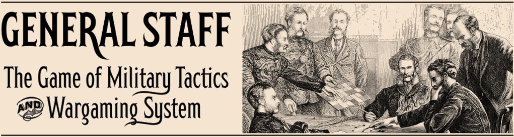
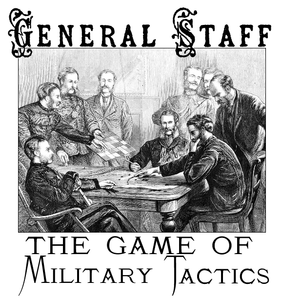
I tell my students that one of the first things they should do when creating a game is design a logo. This may not seem obvious or logical. Probably a lot of people leave designing a logo towards the end of a project. I think this is a mistake.
Click to enlarge.
Once you have a logo it shows everybody working on the project exactly what the feel and image is we’re working towards.
For General Staff I wanted a 19th century feel; something that brought back the original Kriegsspiel, old, faded maps and general staff officers in Napoleonic and Victorian uniforms. The type that I chose (Blaisdell and K22 Monastic) are classic Victorian fonts. The image in the logo is an engraving of the original Kriegsspiel being played; presumably in Prussia.
When you look at the General Staff logo it is obvious what the game looks and feels like; this is not a zombie chasing game, this is not an RPG, this is not Lara Croft, Tomb Raider (games that I all like and play, by the way). General Staff is a thinking game. It is a tactical game.
Ed Isenberg did a fantastic job creating the first map for General Staff.
He perfectly captured the feel of playing Kriegsspiel on an old map; complete with coffee stains and map folds.
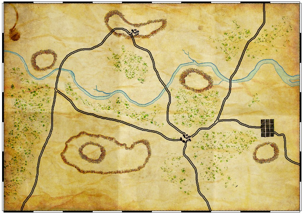
The first General Staff battlefield. Click to enlarge.