We need your feedback about the typography used for editing units in the Order of Battle (OOB) table. In the first example (below) we would like to ask if the typeface for ‘Edit Commander Data’ and ‘Leadership Value’ is legible for you. This font is called ‘Phectic’.
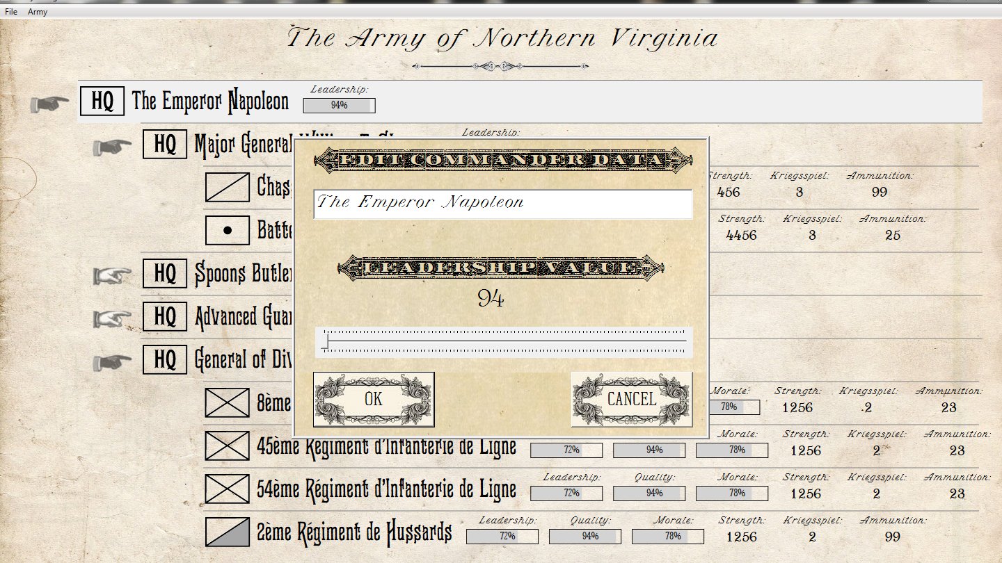
Screen shot from the General Staff Army Design Module Order of Battle table. Do you think the type for ‘Edit Commander Data’ is legible or not? Click to enlarge.
Below is the alternate typography which is currently being displayed for editing the subordinate commander data. This font is called “Monastic”;
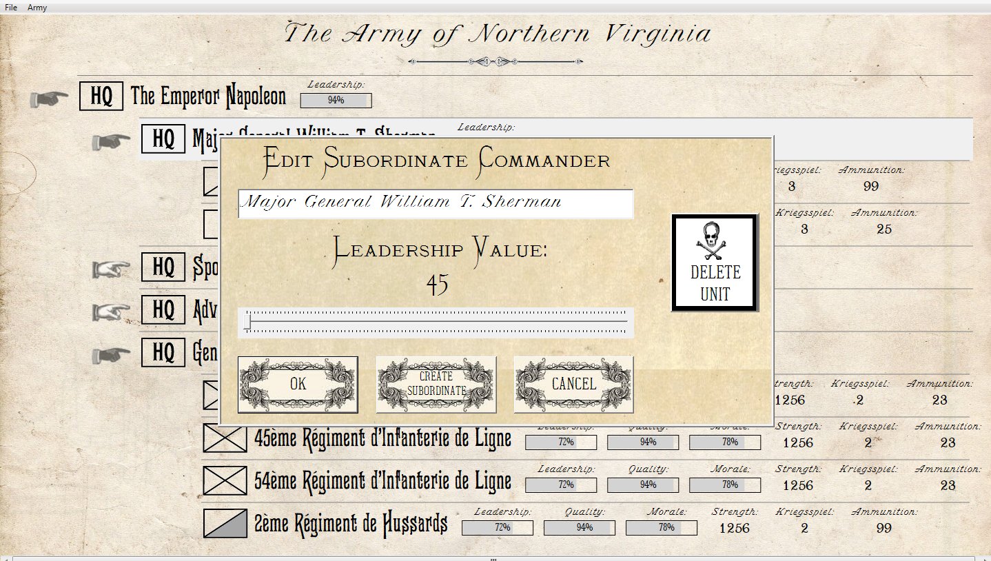
Screen shot from the General Staff Army Design Module Order of Battle table. Do you think the type for ‘Edit Subordinate Commander and ‘Leadership Value’ typeface is more legible than the above display? This font is called ‘Monastic’ Click to enlarge.
Our overarching design goal has been to create a wargame with an ‘authentic Kriegsspiel‘ look. If they had computers in the 19th century what would the design look like? Phectic by the way, is from Walden Font Company’s, “The New Victorian Printshop, Volume One.” Walden has done a fantastic job in finding, scanning and digitizing old typefaces (including a series of the American Civil War that I used on a previous project). A link to their site is here.
Please take a few seconds and answer the survey question below:
[socialpoll id=”2415748″]